Being the Graph Guy, I wanted to know about all the "data visualization" presentations at the upcoming SAS Global Forum 2018 conference. I tried going through the official interface to search for such sessions, but it was difficult (impossible?) to know that I had found them all. Therefore I created a visualization of the visualization presentations (how meta, eh?!?) You can use my graph to find visualization presentations you might want to watch, and papers to look up in the proceedings afterward. Or, if your interests lie in another area, you could modify my graph code and create your own custom graph!
Import
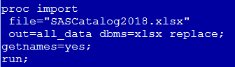
I used the Download Full Catalog link to download the Excel spreadsheet with all the data. I then used the following code to import it into SAS. (Note that instead of using dbms=excel, which only runs on PCs, I use dbms=xlsx which will run on PCs, Linux, and Unix - this is a new 9.4 feature.)
What to Include
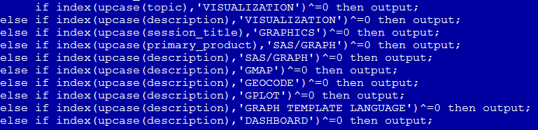
Next, I used the following if-statement in a data step to determine which of the 749 presentations contained certain keywords in certain variables. This required a little trial-and-error, as you might imagine.
What to Exclude
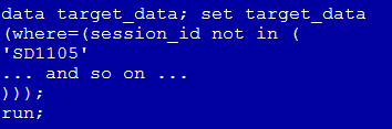
I noticed a few of the presentations matched the keywords, but their abstract didn't really sound like there was much "data visualization" in the presentation, so I used another data step to exclude those on an individual basis.
Visualize my Results
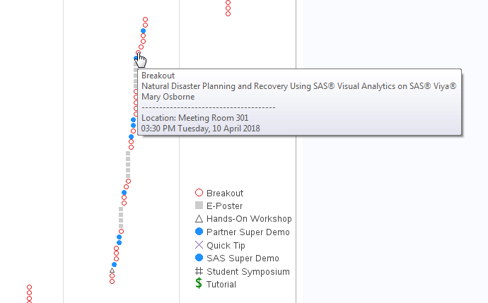
I used a data step to add a variable with HTML tags, so I could have mouse-over text and drilldowns for each presentation. I couldn't figure out a URL to go directly to each presentation's page, so I link to the author's page, and then you can select the specific presentation there (most authors only have one presentation, so this isn't too much extra work for you). I used Proc Gplot to create the graph. Click the image below to see the full-size interactive version (with the mouse-over text and drilldowns).
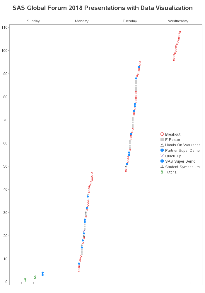
The plot shows there are over 100 presentations that touch on "data visualization" this year (2018) at SAS Global Forum. I used a few different plot markers so you can easily distinguish the different kinds of presentations. If the plot markers line up vertically (in the exact same horizontal position), then they happen at the same time and you'll have to choose which one to attend. You can see the exact time and room in the mouse-over text as shown in the example below (that's my friend Mary's presentation - she's always great, so you should go ahead and put this one on your list!)
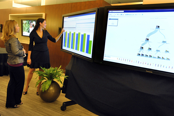
Here's a picture of Mary presenting, so you'll recognize her (see - she's got graphs!). If you go to her presentation, tell her I sent you! ;-)
Did you find my graph useful? Are there any other good "data visualization" presentations I should add? Which presentations are the ones you are most anxious to attend? Let us know in a comment!
(And here's a link to the SAS code, in case you want to modify the search strings to look for different presentations, in your area of interest.)
December 2018 Update: Now that the papers are available on the web, I have modified the links to go directly to each paper! :)


9 Comments
I will test your code to see if I can organize an agenda with overlapping or non overlapping schedules. May be distant between rooms? May be I can automate my attendance LOL
This is fabulous. I will follow your recommendation and see Mary's presentation Tuesday. I might have to use your graphic to plan for any holes in my schedule...
I'm glad to see someone is using the keywords - I should have thrown in a few extra just to get picked up by analyses like this ;-)
Aha - so next year I'll have to ignore the (possibly spammed) keywords, and use some more sophisticated SAS Text Analytics! ;)
This is an awesome way to look at SASGF data! Looks like it captured my EPosters on Using Color in Reporting on Monday and Data Storytelling using SAS VA on Tuesday.
High Five Robert!
You're presenting 2 things at SGF?!? - Then you, sir, are well on your way to being a SAS Superstar! :)
I hope to see some SAS Visual Analytics users at the Zencos Sessions. So far my favorite presentation is the one featuring a mile-high item in honor of our host city. Yes - we are using cannabis data to show you some cool SAS Visual Analytics tricks!
Here's the links to all of the Zencos papers:
http://www.sasgfsessioncatalog.com/#/speaker/company@265
Ah yes! - Zencos (and especially Tricia) is a heavy-hitter when it comes to data visualization! :)
Oh shucks ... I get lots of help!
But check out my preview video .... warning ... it's heavy on the cheesiness ...
https://youtu.be/yVeAbI2XO6I
Love the tagline! I'm working with the Logistics team again in Denver, so I will try to get to 302 on Monday at 3p. Unless I'm on info desk duty.